homeadvisor service request path
overview
The service request flow -referred to internally as the SR path- serves as the main way homeowners connect to available, highly rated professionals for their home needs. The SR path takes the homeowner step by step through questions about the project they need done with their homes and then matches them with the right service professionals that specialize in the project that the homeowner has requested.
The SR path had been redesigned four years prior and was functioning well for the business- but it was ready for a redesign to modernize it again and also solve a few issues with the flow that homeowners had been experiencing.
deliverables
User Flows
Wireframes
Accessibility Audit
Responsive Native Design
Prototyping
software
Procreate
Sketch
Challenge
General Styling Issues
The SR path was redesigned about four years prior- at the time it was a massive step forward and really modernized the flow. Since that redesign- it hadn’t been touched much and was starting to feel dated. It was also redesigned prior to the release of the larger iPhone X. When the product director responsible for the SR path approached me and asked about another redesign effort- I jumped at the opportunity.

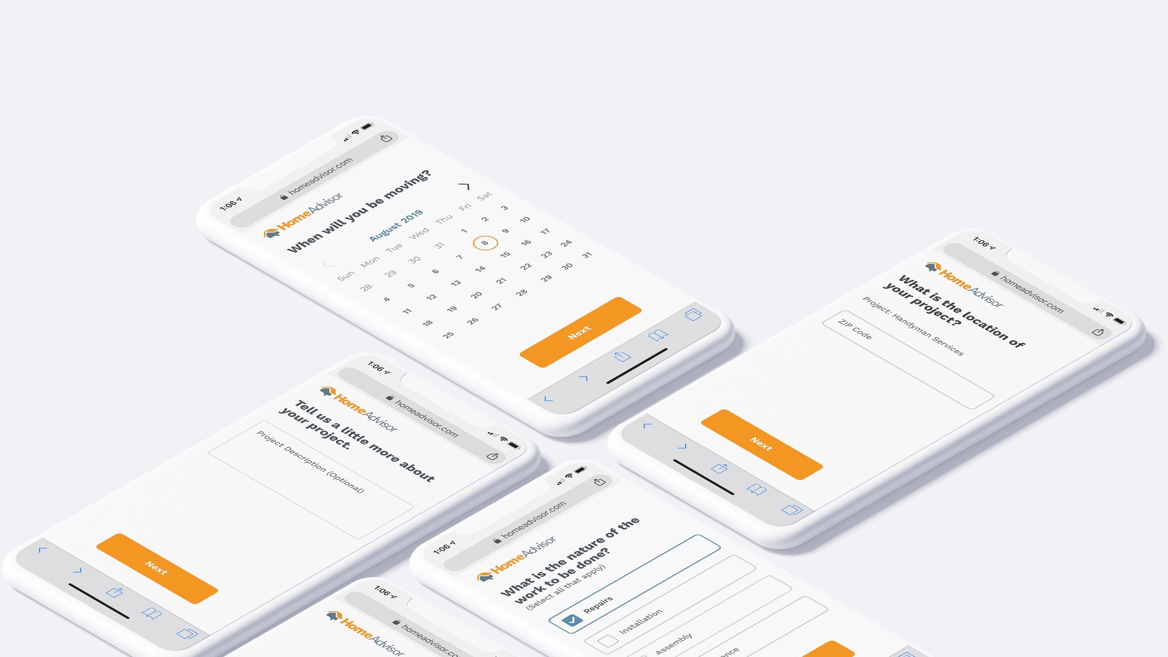
Some of the main issues that we wanted to address specifically were: dated coloring and illustrations; awkward spacing caused by the larger iPhone X phone size (which was becoming our more commonly used device on the site); small click targets; and buttons getting pushed below the fold (even on the larger phone sizes).
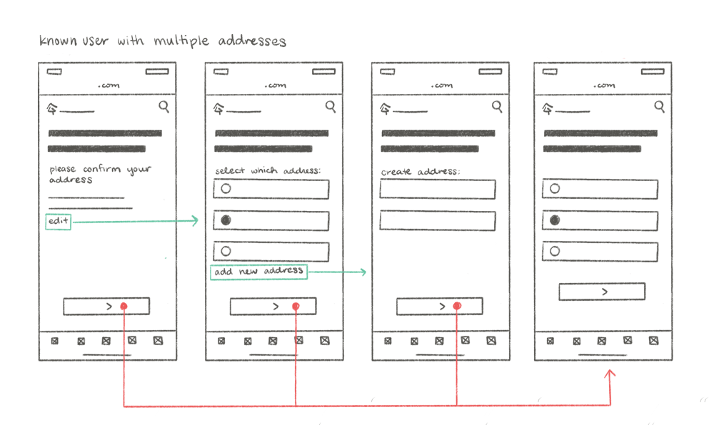
Returning Users - Flow Issues
A particular issue that we were noticing from a page flow perspective was how returning user would get trapped in a multiple step flow that they would have to back in and out of when they needed to update or change the address of their project.
Our goal was to clean up that flow and make it easy to continue down the path regardless if the returning user needed to update or add a new address.

Competitive Research
We started looking at competitor’s flows for inspiration on how we could update our flow and stay up to date with the design trends of the industry.

TaskRabbit Service Request Flow

Thumbtack Service Request Flow

Porch Service Request Flow
Brainstorm
Question Types
The redesign allowed us to look at the entire structure of the SR path- the development team starting taking on the task of examining the backend and assessing how it could be built better. While they did that- we started examining the question types and if there were redundancies or oversights.
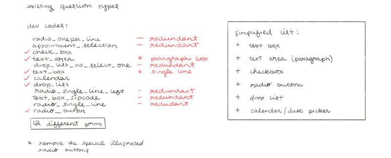
We ended up simplifying down our question types from 12 different types to needing only six.
Form Styling
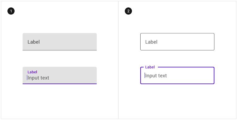
We started brainstorming some different ways to style our form fields from a design perspective- but while we were working through this exploration the idea of web accessibility was brought to our attention and we pivoted a little bit to account for much more accessible form fields.
Initial Exploration
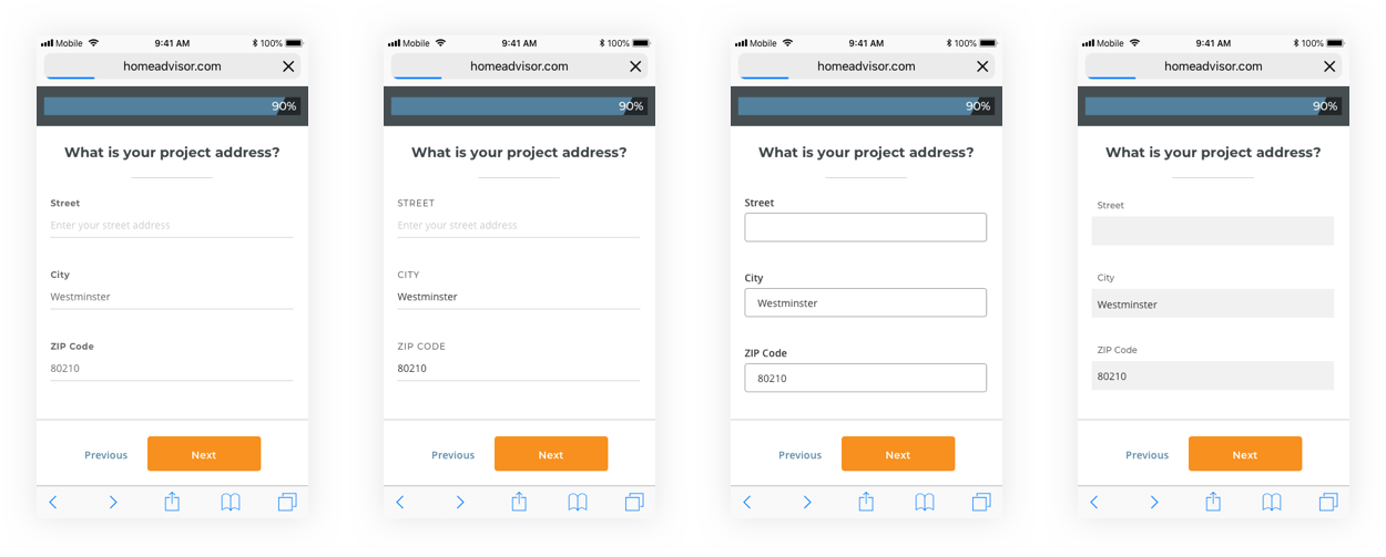
We took a moment to pause our design explorations to sit down and talk about accessibility needs. We focused on our form fields and how to optimize them for everyone trying to use our site.

After that discussion I started doing some visual research and landed on the suggestions from Material Design- and started from there and made it our own.
Form Fields Design & Wireframes
Single Input
We landed on a styling very similar to Material Design for our form fields that accounted for accessibility and allowed for multiple different states of interaction and feedback.

Special Forms
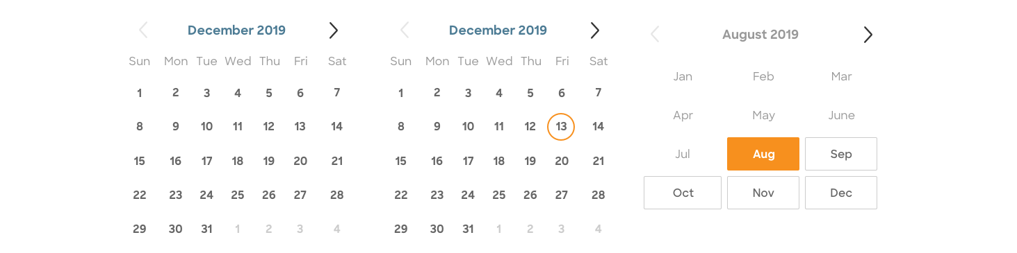
We continued the same styling we created for the single entry form through our other pieces- utilizing larger click targets with a bold switch from selected to unselected.
Radio Button

Check Box

Text Area (Paragraph)

Calendar Selection
Wireframes
From there I started working through how the pieces would all work together visually and fit nicely on the larger iPhone X screen- but also allowed for smaller screens with lots of white space that allow the main button to float seamlessly at the bottom of the screen regardless of screen height.
Layout Wires

Known User Flows + Wireframes

We then also started tackling the known user experience. We wanted the user to not have to back out of a flow to get back to the SR path just because they needed to update, change, or add a new address to their account.