homeadvisor storefront flow
overview
In late 2018, HomeAdvisor acquired Handy when they saw an opportunity to combine their two unique business models to better serve the home services industry.
HomeAdvisor had a long standing and successful business model of matching homeowners to home professionals that are screened and approved. The homeowner would answer a series of questions about their project and then HomeAdvisor would match them to top-rated, local, available professionals. The majority of the transaction (negotiation, scheduling, and payment) happened offline- outside of HomeAdvisor’s platform.
Handy had a differing model that pulled the entirety of the transaction onto their platform. Homeowners could customize their home project, select a date and time, and pay for the service, all online.
deliverables
User Flows
Wireframes
Responsive Native Design
Prototyping
software
Sketch
Challenge
HomeAdvisor’s Existing User Flow
HomeAdvisor’s original user flow focused on matching homeowners to available local pros and then leaving the rest of the interaction to the two parties. After customizing their project details through a focused form that dialed in on the specific details of the home project- HomeAdvisor’s system would match those project details to up to four available pros. Homeowners then selected the pros they were most interested in and then pricing, scheduling, and communication went offline between the homeowner and the pro. HomeAdvisor remained available with a customer care team to help solve disputes and match to additional pros if the homeowner needed.

New User Flow to be Introduced
With the acquisition of Handy- HomeAdvisor wanted to add an additional option for homeowners that wanted less hassle and a more online experience. Handy’s system allowed for payment and scheduling to be handled online. The general flow would remain the same- the same customized project details flow gathers all the info need to give the homeowner an exact price for their project and show them available appointment times for a pro to complete the work. These added features required new flows to be created that had never before been introduced to the HomeAdvisor flow- particularly calendar booking features and a credit card capture and payment processing feature.

Brainstorm
User Flows
We started the project off with a brainstorm phase that served as our kickoff- this first process focused solely on the storefront design and included myself and another senior level designer, Brian Ashburn. During the meetings the asks were narrowed down to building a storefront for this eligible services, a flexible service page (like a product page) that could handle the wide range of services that were available, and a checkout flow from that service page.
We were first focused on the storefront and followed up with fast follow MVPs for the service page and the checkout flow.

During the brainstorm we also came to general consensus that some competitive analysis specifically for checkout flows and payment processing for detailed flows would be needed for us to get off on the right start for our MVP effort for this project. So while we kept moving forward on the new storefront design- we handed off our needs to our research department.
Service Block
A large blind spot we discovered in our initial brainstorm meeting was that we were missing the main element of the storefront page- a brand new service block design.
HomeAdvisor had never in the past needed a design that allowed the homeowner to see a high level view of the service so they could compare and browse a lot of services at once. The pro was always the piece we were trying to help the homeowner compare and browse before- so we set out to do some research and analysis on what features to include in a featured service block.
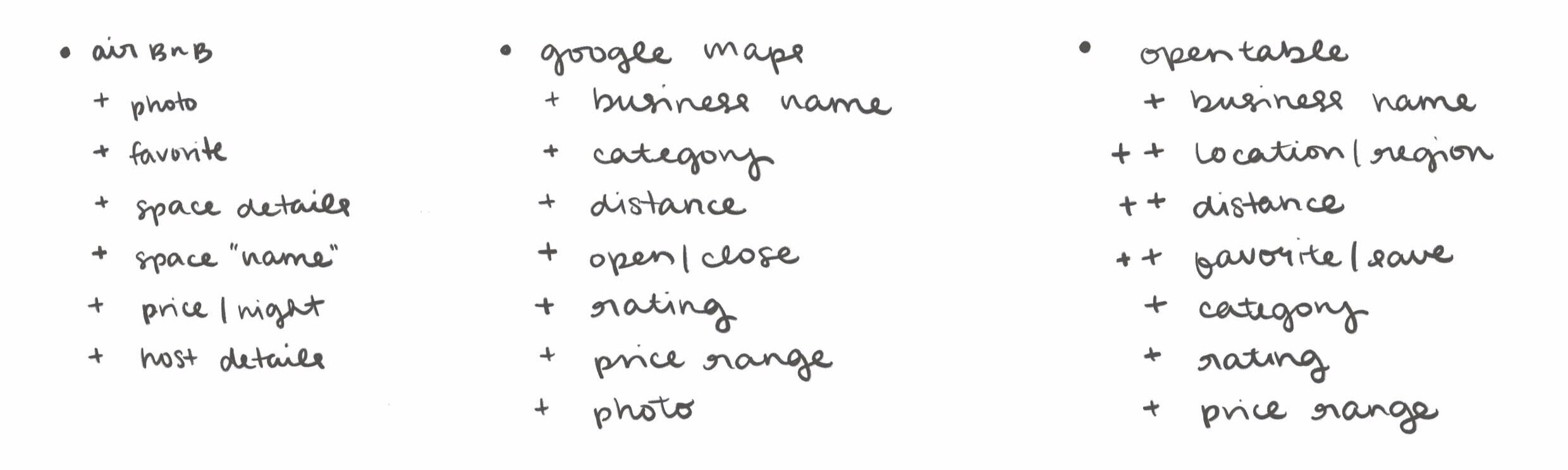
We narrowed down our competitive research to pieces of info that we had available and seemed the most standard for a featured service block like this.

The main pieces we focused on for the MVP launch of storefront was: a featured photo, the service rating, the starting price, a space for deals/coupons to be featured, and urgency tags (i.e. service booked 20 times today, highly rated service).
Delivered Research
The internal research team at HomeAdvisor started to look into the question of user’s needs, wants, and concerns when interacting with an online purchase path. Their key points included three take aways they wanted us to consider.
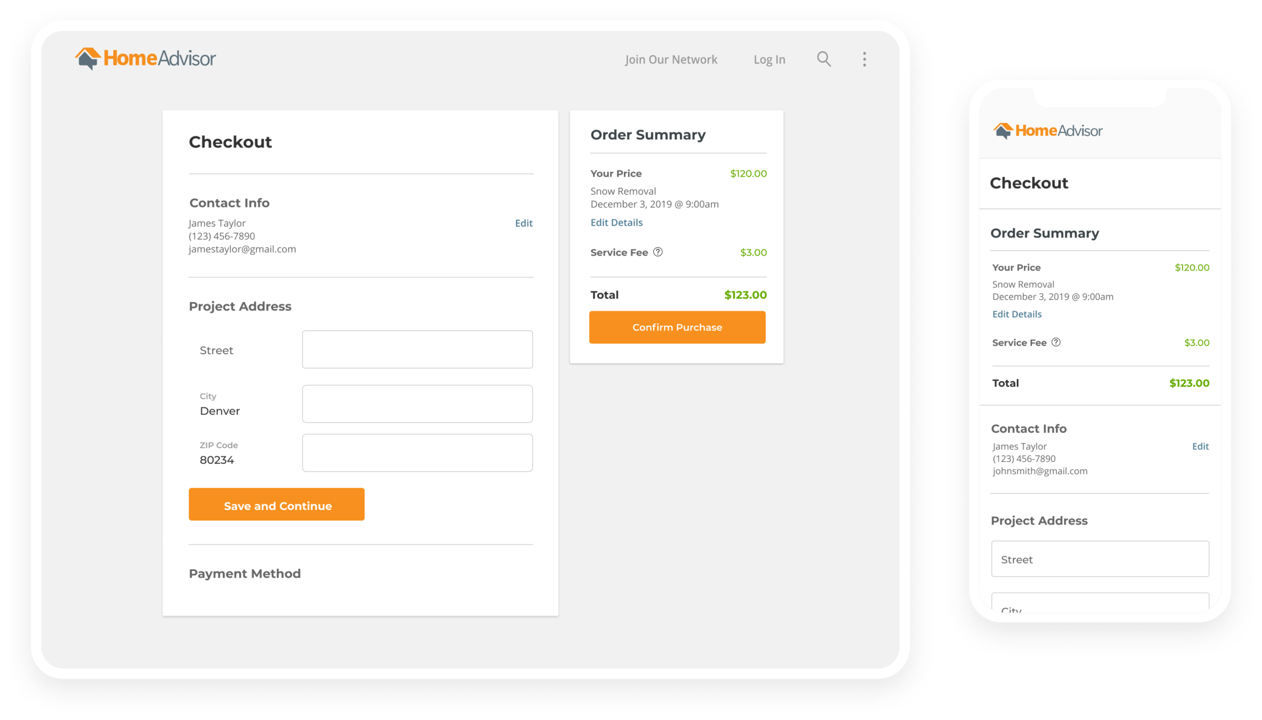
On average 26% of users abandon purchases during checkout solely because the flow was too long or too complex
Add more pages to reduce number of form fields on a page- it is recommended that no more than 5 form fields per page.
Utilize autofill whenever possible and preselect the most popular responses to the questions when possible.
User Flows + Wireframes
User Flows
After reviewing the information our research team gathered and presented- we landed on a user flow that split up questions for services that had more than five so that the user never saw more than five questions at a time. We also leaned into an accordion view for our checkout flow and making sure users only had to fill in five or less forms for each expanded view. The wireframes below show the details of each page.

Wireframes
I set out to create mid-fidelity wires with minimal color and copy based on the learns from our research team, our page flows, and our discussions over the storefront page. Since this was a multi tiered project- some of the work was tackled by my teammate Brian.
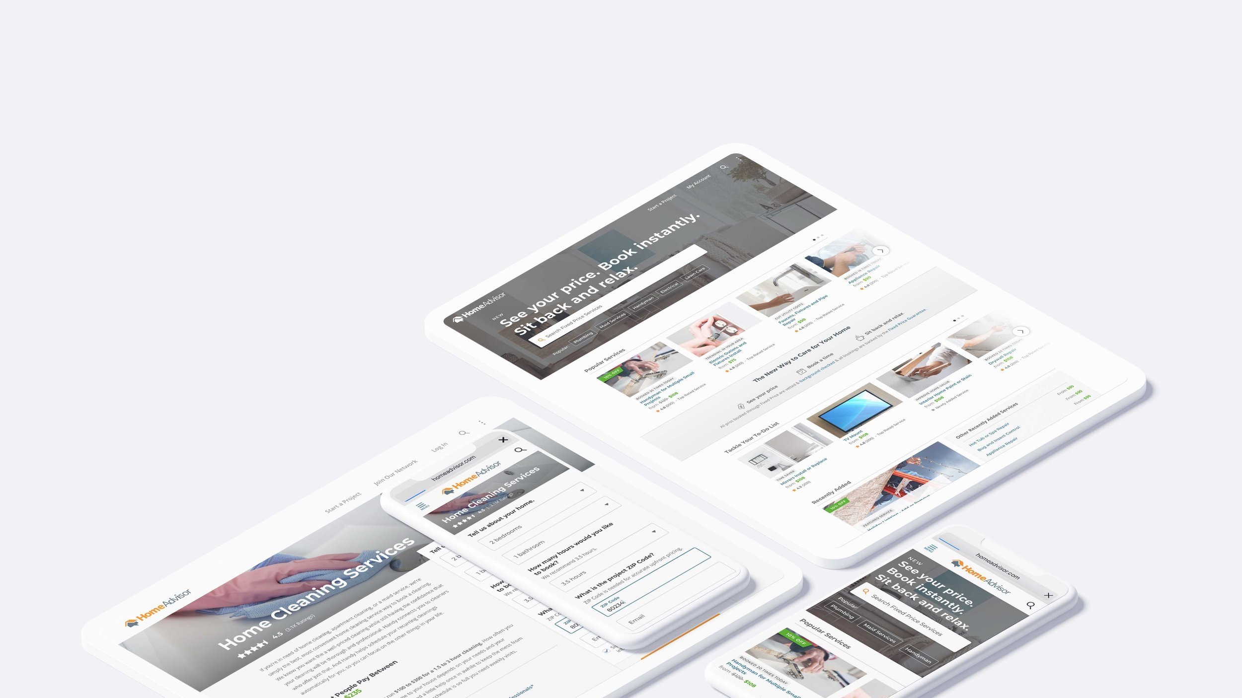
Mid-Fidelity Storefront Page
Storefront was a particular challenge- we had been functioning originally under a two week timeline to turn around both mid-fidelity wires and high-fidelity mocks for dev. After an initial review with our CPO though- the timeline was pushed down into a 24 hour turnaround. To achieve this goal Brian Ashburn laid out this pseudo high-fidelity wire for our CPO to look over while I continued pushing on the high-fidelity mocks.
With the CPO’s approval from this quick turn stage- I was able to continue working without pausing on the high-fidelity mock.

wireframe created by teammate- Brian Ashburn
Mid-Fidelity Service “Product” Page
I had more time to process through the purchase path flow- so I created a couple mid-fidelity options that we worked through together as a team (this team including the product manager, the product director, and the front-end developer).
We needed this page to be able to flex to accommodate a wide range of services details- as well as support the first five questions of the project customization flow. The two options played with the placement of the questions- whether putting them in a right rail with the pricing or keeping the pricing focused on the right rail with the questions in the body of the page.
Ultimately we decided on combining the pricing and questions in the right rail.

Checkout Flow Wireframes
Here is the breakdown of the product page and checkout flows prototype that we create in mid-fidelity for leadership and the team to review before we continued work on the high-fidelity designs.
Five questions or less flow

More than five questions flow

Desktop layout example