homeadvisor design system
overview
As a growing design team and product organization in general- I started a large initiative to organize and clean up the design system for HomeAdvisor. The goal was to streamline our process and modernize the UI design of our system as the team grew from being just me to ultimately five product designers.
I transitioned from Photoshop to Sketch in 2017 and added Zeplin into my delivery process for front-end dev. I had started the process of creating a symbolized Sketch library just for myself. From there, the process took on momentum as the team quickly grew. Through research into atomic design and usage of the Sketch Cloud- I created a shared design system that was flexible and consistent across our new team.
deliverables
Design Audit
Component Library
Documentation
software
Sketch
Challenge
Background
Back in 2012- I participated in a massive rebrand effort that turned Servicemagic into HomeAdvisor. We took on the task of redesigning everything and changed everything from the name and logo to the color palette. The effort was a massive undertaking that myself and two other designers worked on together.
By 2017- we had not changed many of our UI elements are were starting to feel a clear need to update and modernize.
Outdated Overall UI Element Styling

In addition to this decision that our UI elements needed updating- we were also struggling with inconsistencies across our UI elements. The three of us designers all worked in Photoshop and tried to stay synced up on the buttons and styling that we were using- but it proved difficult to remain consistent with our UI elements as we were each managing our own photoshop files and assets on our own.
Plus- we were delivering finals designs in a very inefficient manner- uploading flat jpgs from Photoshop into a JIRA story- which offered very little direction to the front-end developers.
Inconsistent Button Styling

all these buttons were live at the same point across different places on the site.
Another result of our inefficient system was duplicated icons. Not only were we creating multiple icons within our designs- but some of the front-end developers were creating the icons they saw in our flat jpgs themselves (not knowing they could ask us for our original svg files). This created a ton of duplicate icons as well as very inconsistent artwork (e.g. inconsistent stroke weights, inconsistent sizing, and overall inconsistent styling).
Duplicated + Inconsistent Icon Artwork
Overall Challenge
We needed a full overall of our design process for product.
Our design system needed to be updated, organized, and streamlined. Ultimately, we needed to make it flexible for an entire team to feel confident they were all using the same components.
The process for delivering our final designs to the front-end developers needed to be streamlined and optimized for their needs. They needed easy access to the redlines of our designs and the ability to grab assets quickly.
Atomic Design Research
Together as a team (myself and the other Product Designer) we started looking into atomic design to use as the main principle behind our design system.
Basic Atomic Design Structure

At this particular time- it was just the two of us working as product designers. Matt Wallen, my team mate, focused on the app while I focused on the responsive website. So we were working in tandem on our design systems- as the app and website had slightly different look and feels.
Together as a team we decided to focus our design system on the three building blocks from atomic design: atoms, molecules, and organisms. I focused mostly on atoms and molecules in the kit to allow for a flexible but structured system.
Atoms
Fill colors
Stroke colors
Stroke weights
Text styles
Icons
Molecules
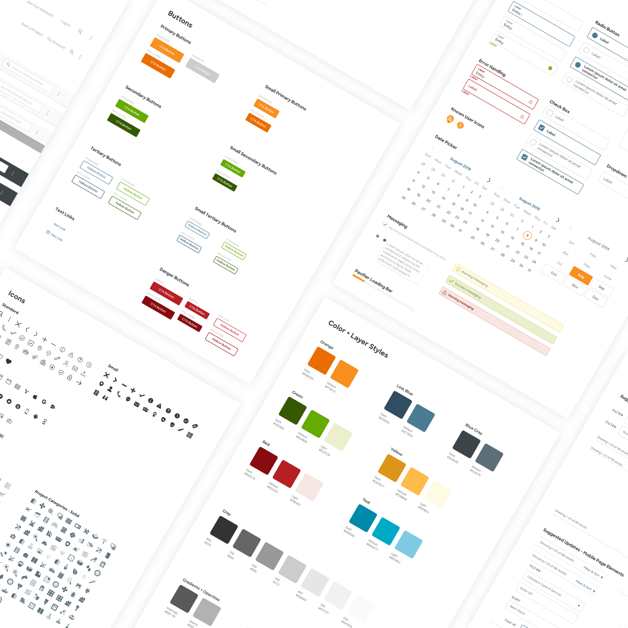
Buttons
Form fields
Star ratings
Pricing tags
Pro badges
Brainstorm
Software Research
The whole process of implementing a more efficient hand off to dev started when I discovered and started utilizing Zeplin. I was still using Photoshop to create all of my designs- but starting handing them over the the development team through Zeplin because it allowed for redlines and gave them the ability to download assets.
Photoshop was not a pixel perfect software and wasn’t really crafted with UI design in mind. So after some difficulties between Photoshop and Zeplin, I transitioned over to Sketch.
That transition cleaned up the redlines in Zeplin and opened the door for me to create a Sketch library for my work flow. My front-end developers embraced quickly and happily with only positive feedback for the change.
From there- the team quickly grew and we started researching collaborative tools to help the team grow without much difficulty. As a team we looked into Figma, InVision, and Adobe XD. Ultimately landing on Sketch Teams and Zeplin.
System Organization
Through the process of teaching myself Sketch and how the component libraries worked- I discovered pitfalls as I was created a component library for myself. I wanted to approach creating a design system for the entire team in a more organized and streamlined manner.
Design System Notes for Sketch Library Organization

I took my learnings about atomic design, my understanding of how a Sketch component library worked best, and my understanding of the needs my team would have for a design system- and I brainstormed the least amount of symbols necessary and how to organize them in an logical manner.
I started with the atoms. This was the foundation of the design system and the most time consuming part of the process.
My Process for an Atomic Foundation
1. define every single color style
- including color fills, strokes (color and weight), gradients, and opacities2. organize every single text style used through the site
- utilizing a naming structure that worked like this:
t-shirt size / text alignment / font family / font weight / color3. then clean up our entire icon set so it could be delivered to development to be made into a font as well as added into Sketch to be flexible components
- this included 60+ UI icons and 180+ service category icons*see next section on the process to clean up the icons for seamless handoff between dev and design.
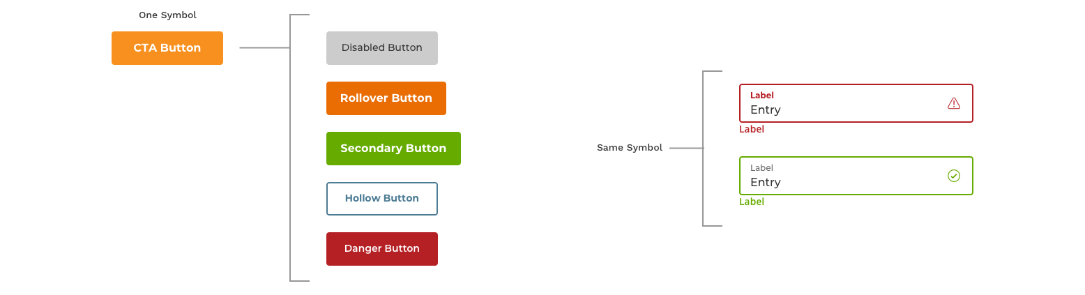
With the foundation of the atoms created in the Sketch library- the rest of the design system came together seamlessly and efficiently. Multiple elements in the design system could depend on a single component in the library.
I created the rest of the molecules necessary for consistency across our team- and I built them to rely on the atoms so that elements could be switched quickly and easily to make all of the individual elements used consistently across the site. Those molecules were broken down into three main sections; buttons, forms, and results lock ups.
Buttons
Primary
Secondary
Tertiary
Links with Icons
- left align icon
- right align icon
Forms
Input
- single text box
- paragraph text boxSelection
- radio button
- check box
- calendar selectionFeedback
- error handling
- success handling
- alert banners
- loading bar
Results Elements
Ratings
- five star rating
- simple star ratingPricing
- with discount
- without discountTags / Badges
- discount banner
- attribute tag
Example of Flexible Symbols Dependent on Atoms
The last elements added into the Sketch library for our design system were the only organisms to be added: the site nav, the site footer, and our standardized accordion menus.
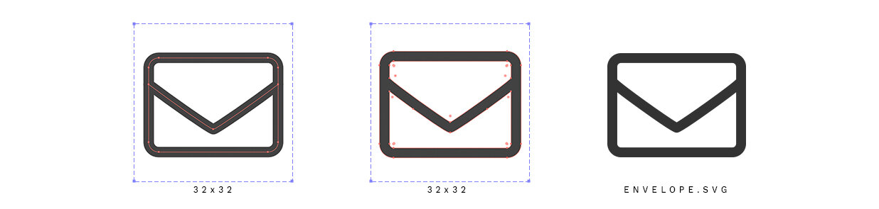
Icon Cleanup + Creation
The most hands on part of this entire initiative was cleaning up and organizing our icons so they could be easily turned into a font as well as added into our Sketch library. It was a simple, but time consuming process.
Several of the most important pieces were:
keeping all the icons within consistent 32x32 art boards
maintaining a consistent naming convention
keeping all of the stroke widths the same
then turning all those strokes into outlines