homeadvisor homepage redesign
overview
Back in 2012- I participated in a massive rebrand effort that turned Servicemagic into HomeAdvisor. We took on the task of redesigning and changed everything from the name and logo to the color palette. The effort was a massive undertaking that myself and two other designers worked on together.
Since then we’ve consistently iterated and updated the homepage of the site to better serve our homeowners as well as stay up to date on the design trends of the rest of the internet and our competitors. This latest update happened in 2018 and was a massive undertaking that included multiple departments across the organization and approval from our C-level executives.
deliverables
Wireframes
Design Style Explorations
Responsive Native Design
software
Procreate
Photoshop
Sketch

Challenge
Background
The homepage has fairly low traffic and the majority of the traffic remains above the fold- mostly focused on the search field. It had been through multiple redesigns since my time at HomeAdvisor and I had participated in different capacities for each one. This newest effort though was my main responsibility- I functioned as art director for this project and was responsible for the final product.
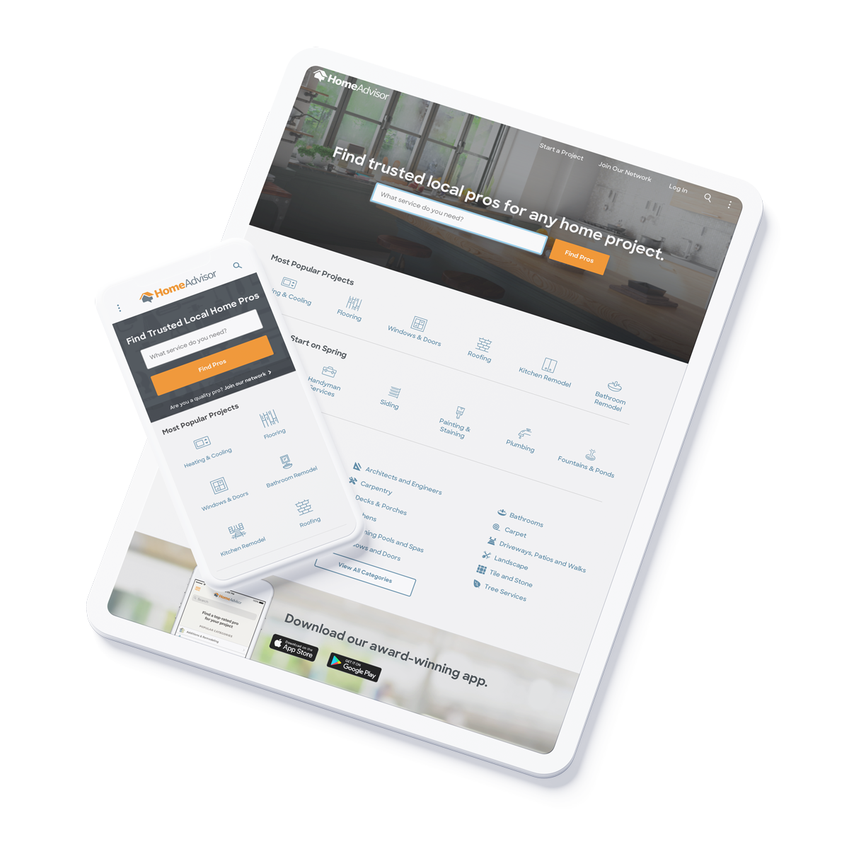
The main goal was to freshen up the design with more modern photography and more white space to clean up the look at feel of the site -without sacrificing conversion on the page.
Existing homepage design
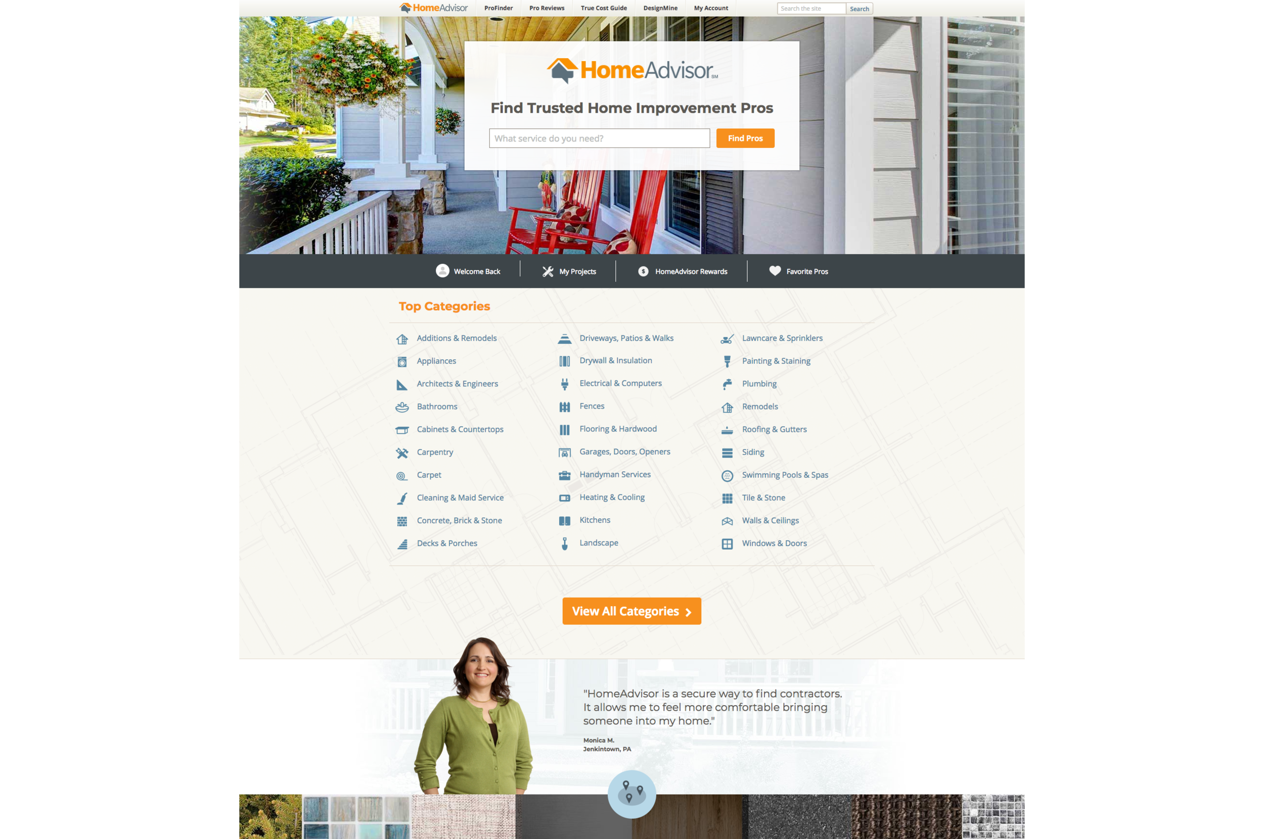
Past iterations of the site since rebrand

designs created by team members : Shay Wright and Matt Wallen
Competitive Research
We started with some competitive research- gathering an general idea of what our competitors were doing stylistically on their homepages. We saw a consistent focus on larger white spaces, calling main attention to large search fields, and clean icons.

Thumbtack homepage

Yelp homepage
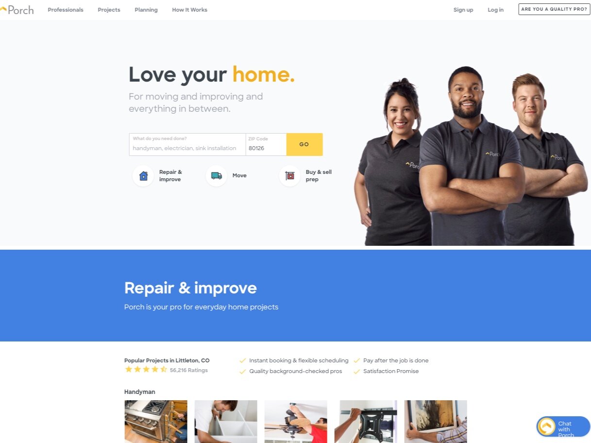
Porch homepage
Brainstorm
Project Kickoff
We kicked off this project after our CPO, Brandon Ridenour, approached me about redesigning our existing site. My team had done this a couple times before and he requested a similar process this time around.
The last time we had taken on redesigning the homepage we did it in a collaborative fashion. Each designer on the team- marketing designers and product designers alike -did an explorative design that they would present to the team. We then would talk about what we liked and didn’t like and would come up with 2-3 designs that we would present to the larger product organization.
We started the process with a kickoff meeting as a team where we discussed the main objectives of the project.

Collaborative Exploration
I started my part of the collaborative exploration with some loose wires to help organize my thoughts about a new homepage. I worked through several iterations- examples of some the layouts I played with are below.
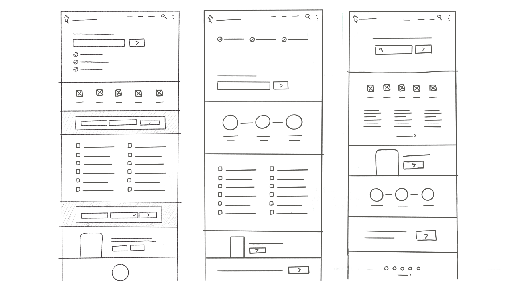
A week after our kickoff- we sat down as a team and looked at everyone’s options and explorations. We each brought about two layout options. A couple of the options that we discussed together as a team are included below.

Collaborative contributions in order from left to right: myself, Shay Wright, Becky Tillett
Ultimately the explorations were handed off to me and I took all the options and the notes from our discussions to create another round of wires and full mocks to present back together as a team before we took them to our product leadership and CPO.
Wireframing
I focused on keeping the header and a few of the featured services with their icons peeking above the minimal 600px fold. I added icons to our “link brick” of service tasks to add visual interest. I took the same approach for the screening section of the homepage with custom illustrative icons to depict the different aspects of our screening process. The app promo took on a large, but straightforward, ad block on the page. Plus, I made sure there was space available for any partner ads we wanted to feature on the page.
Overall we aimed for minimal copy, large white spaces, and artistic shots of homes.

The rest of the process went through a standard high-fidelity mock up. The main features of the page fell together quickly- but we spent a lot of time after deciding on photography. In the end we tested two different photos in our main hero image area behind the large search box.
We chose a bright, artistically cropped photo of home and a dark, home interior shot to test against each other.

the two photo options we tested