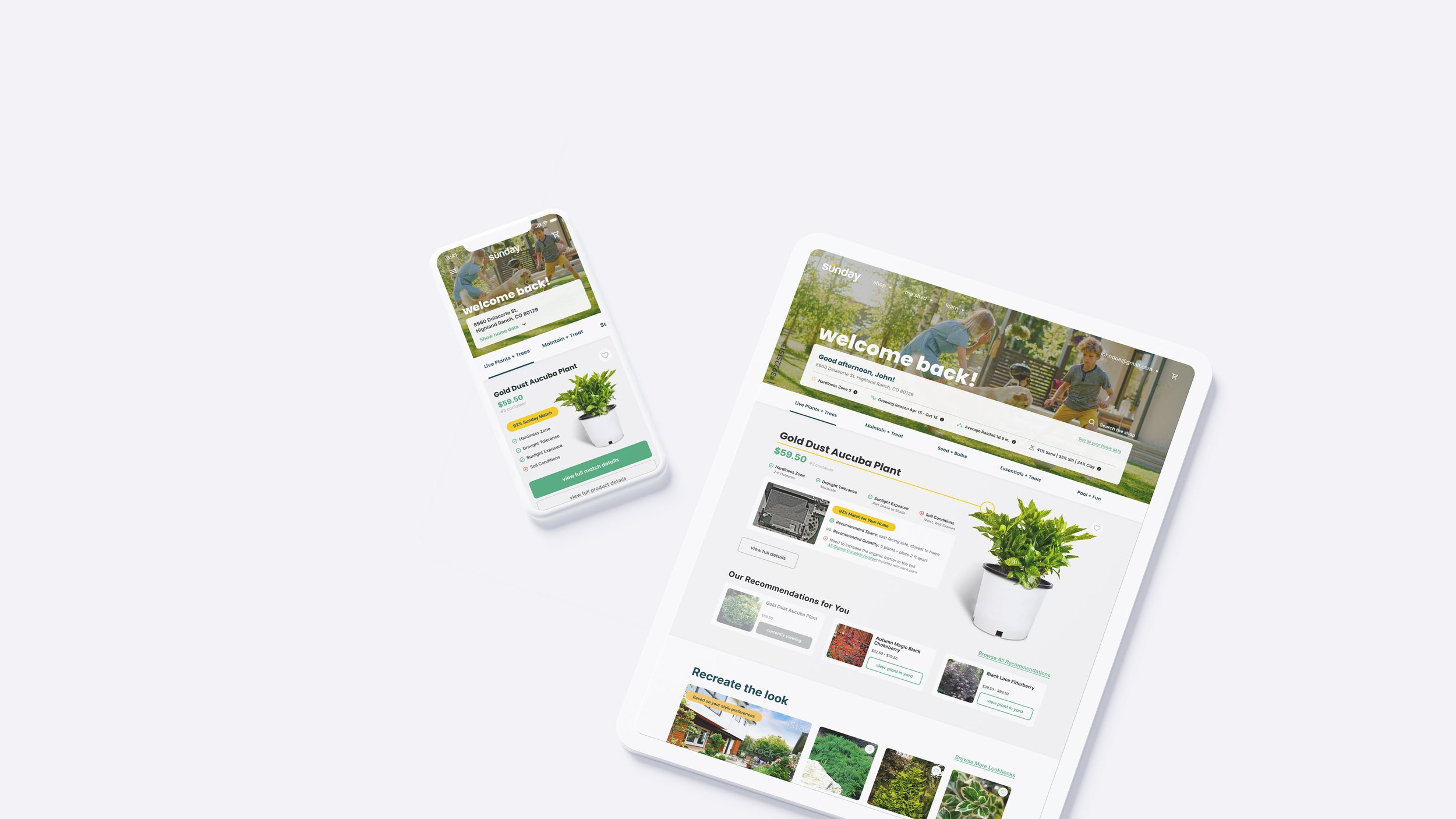
sunday storefront
overview
Sunday helps homeowners cultivate a beautiful lawn with products that support the whole ecosystem. They take the guesswork out of the equation with customized plans based on customer’s specific climate and needs.
Sunday asked Fresh to help them build their new storefront so they could bring live plants into their offering with the same exceptional customized recommendations and support.
designed and built: 2021
deliverables
Competitive Analysis
User Interface
Prototyping
software
Figma
challenge
Sunday has diligently built a strong customer base with dedicated customers signed up for yearly lawn plans to maintain their outdoor spaces effortlessly through products that are customized to their specific climate and lawn.
They wanted to expand their offering to their customers by bringing live plants into their product line up, with the aim of providing an even more diverse range of options. However, they recognized the importance of maintaining their signature dedication to giving their customers smart recommendations based on their specific climate and lawn conditions. They soon realized that their existing product listings page, product detail page and checkout flow, although efficient for their current offerings, might not be robust enough to handle the unique needs and requirements of live plants.
existing customer survey
Sunday proactively surveyed their existing customers to understand their needs in lawn and garden, with a focus on landscaping and outdoor plants. This commitment to personalized service and tailored solutions demonstrates Sunday's dedication to enhancing outdoor spaces based on customer feedback.
live plant take aways
78% shop for live plants at the local nursery
72% find deciding what plants to buy the most challenging part of buying live plants
55% feel that knowing how to care for the plant to be the most challenging part of buying live plants
existing customer stats
3 out of 4 Sunday customers have landscaped beds
85% are totally DIY; 10% have lawn care, but no gardening service
competitive analysis
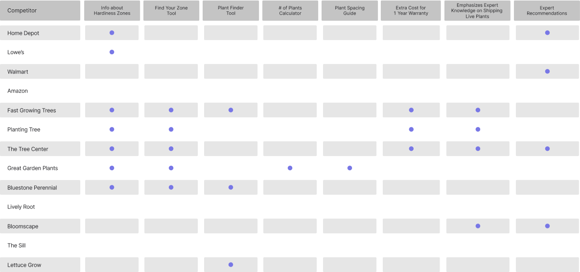
The engagement officially started with an in-depth competitive analysis, which served as the foundation for the project. We compared the strategies and tactics employed by competitor’s product pages. Armed with this knowledge, we were able to devise a tailored approach that would help our client stand out in the market.
After collecting and processing through our competitive anaylsis- Fresh Product Design hosted a day long design studio session with the stakeholders at Sunday. We reviewed with them the results of our analysis and then brainstormed as a group.
A review of the full deck prepared and shared with the client can be reviewed on request.
high-level findings
It’s a moderately crowded space dominated by Home Depot & Lowe’s
The majority of competitors use an outdated design style. They’re also dealing with cluttered pages full of SEO content and cross sells
Smaller online boutiques (mostly indirect competitors) are popping up
prioritizing storefront features
As a group we decided to focus on three key pages in the experience: the Sunday storefront, the product list page, and the product details page. Other pieces considered and ultimately deprioritized for my team to work on was the shopping cart and checkout process, email marketing strategy, and the Sunday homepage.

recommended areas for improvement
ui + ux design
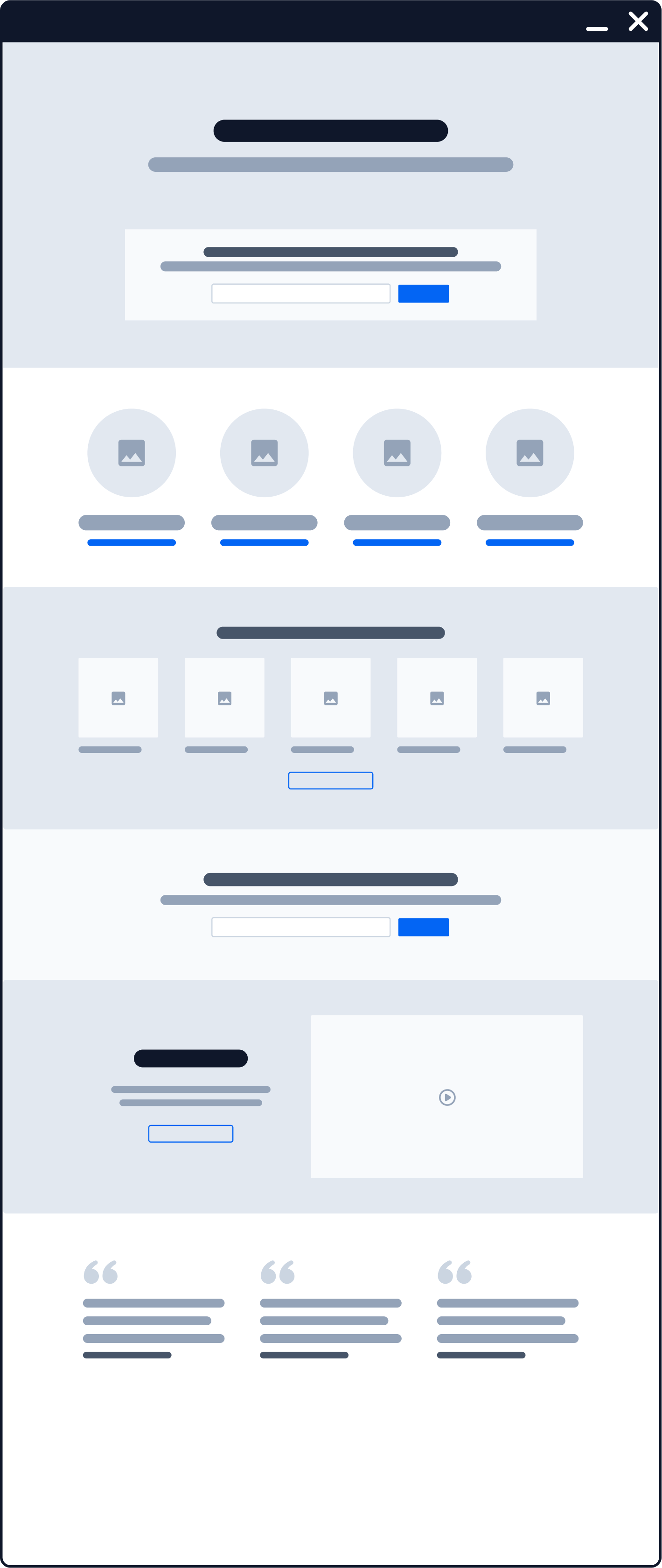
After the design studio, I was tasked with processing and visualizing the ideas that emerged. Once I had a clear understanding of the goals and objectives, I started on creating high-level user flows and wireframes that would serve as the blueprint for my final designs.
high-level happy path user flow
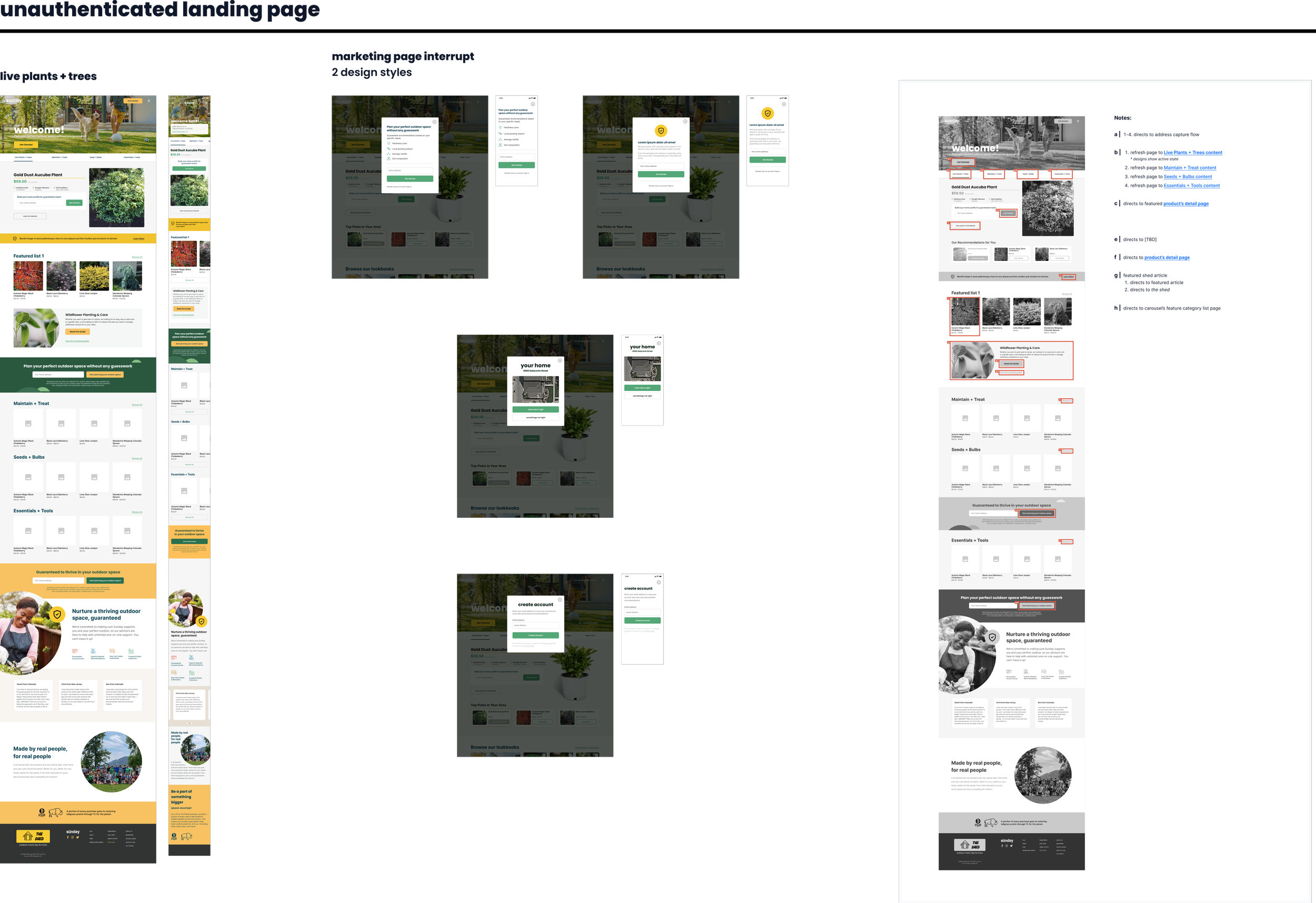
The user flow served as a blueprint for the page specs on user interaction.
expanded wire framed page flows
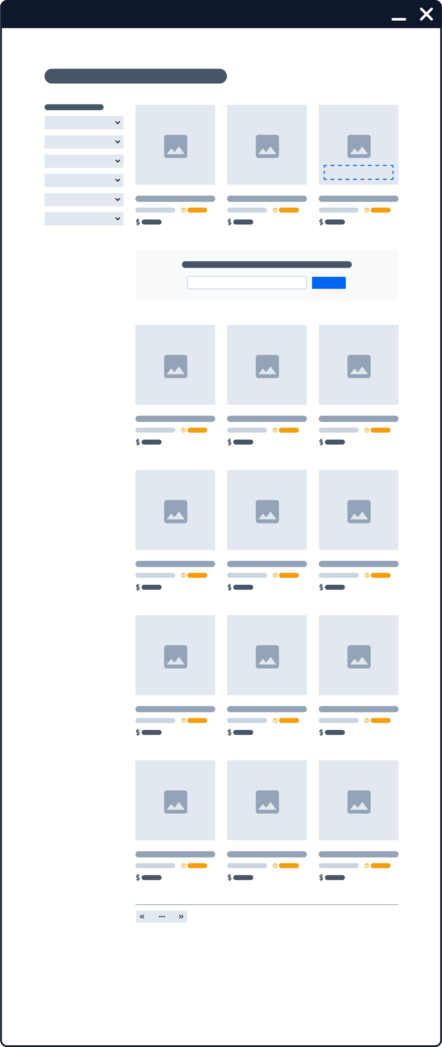
While some may argue for the necessity of comprehensive wireframes, we made a strategic decision to focus on maintaining momentum with the client and only do quick marker roughs. This allowed us to dive headfirst into full color mocks and testing iterations, expediting the development process and ensuring a streamlined experience for the end-users.


final deliverables
With concepts approved- I began working through the full color designs with a heavy emphasis on mobile first and adaptive break points. Sunday already had an established component library that I pulled from to maintain consistency across the brand- only adding new components as needed.
Since I was handing off the Figma file to Sunday’s internal engineering team, I built out a user flow map with link references.

